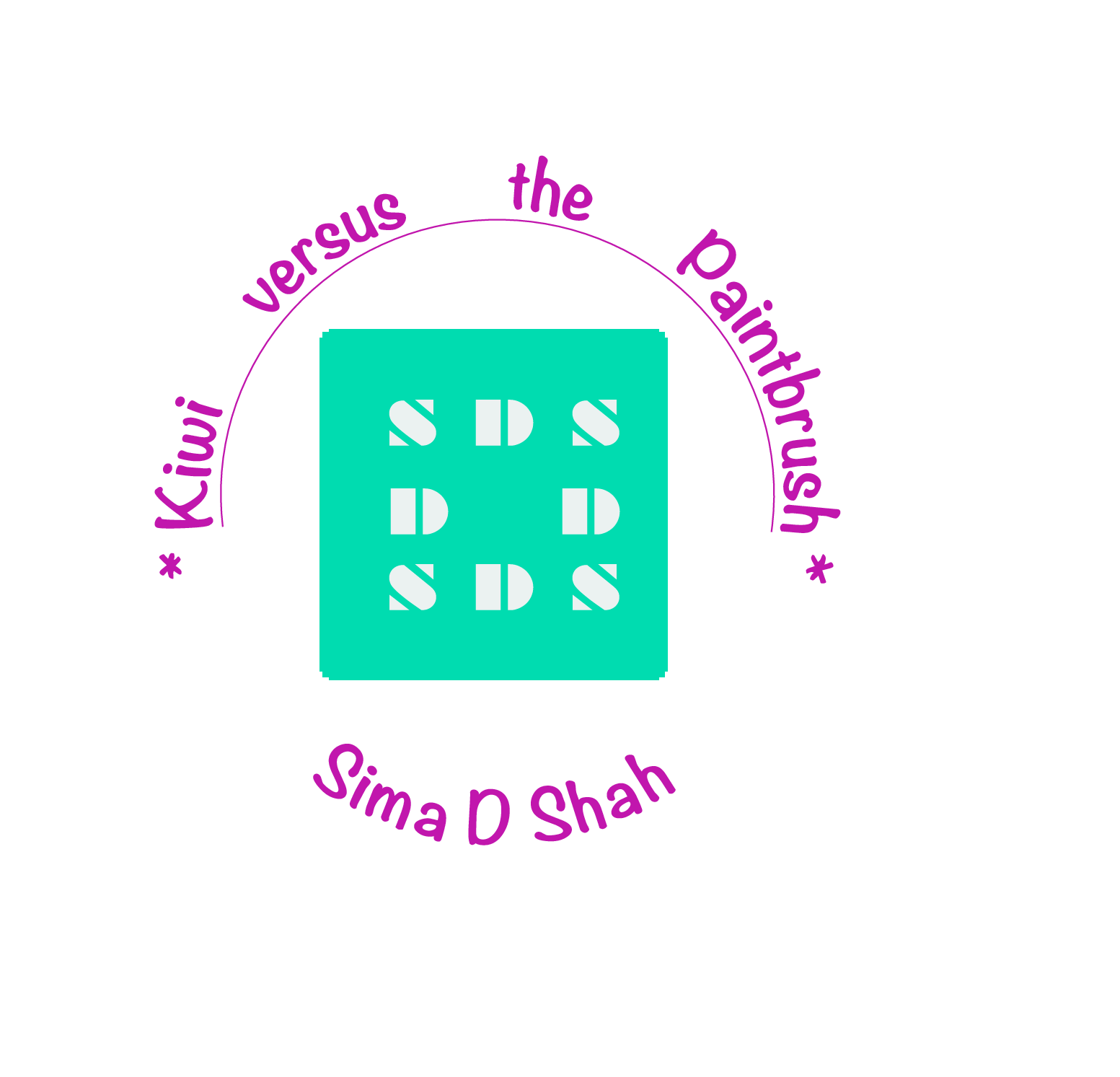
My initials are enclosed in a tight green square which is a loose nod to Hanko stamps. My favorite wing at the Art Institute is the Japanese woodblock print corridor on the first floor. The narrow alleyway is dimly lit displaying intricate prints. If you look closely, many of the prints have the customary deep red mark created by the artist’s signature Hanko stamp. These marks usually take the form of either a rectangle or circle and are the size of a quarter. I have always found these signatures strikingly beautiful.
Postmark imprints found on letters is the inspiration for the cobalt violet text that is on the outside perimeter of the square. The compact circular pathway design of the postmark and the information contained within the imprint is ingenious and universal, and has been around since the 17th century. For myself, writing letters was how I was able to stay in touch with my grandfather. Phone calls were outrageously expensive and the call itself was incredibly patchy and chaotic - it sounded like the other person was calling from Neptune when in fact they were living in the lively urban city of Ahmedabad.
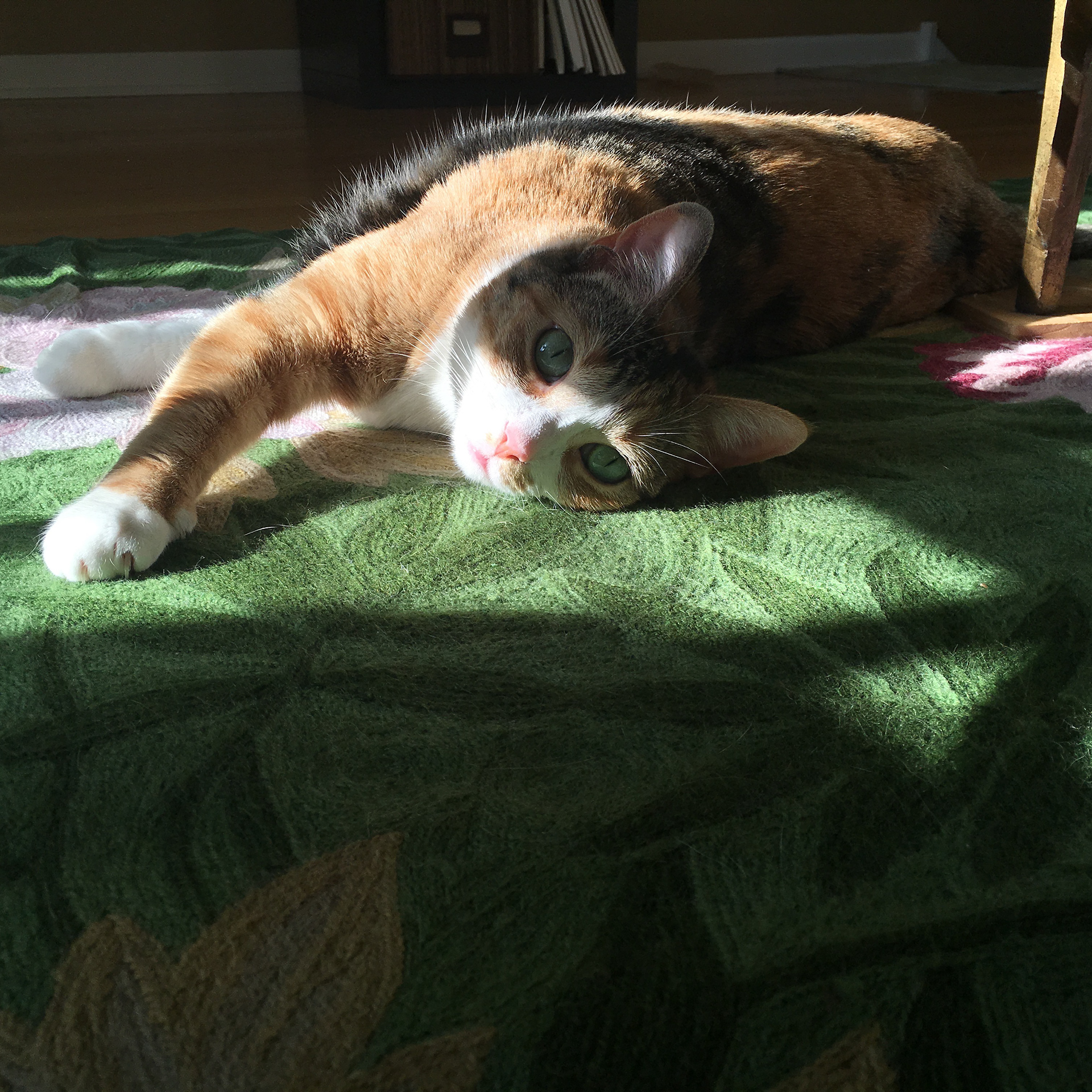
Kiwi the calico (=^-^=)/
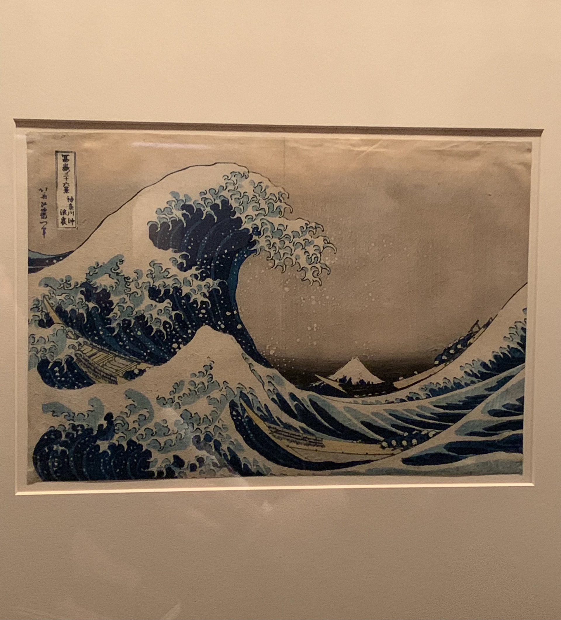
Art Institute of Chicago- The Great Wave off Kanazawa by Hokusai. It is not currently on view, the print circulates every five years. Mount Fuji is seen in the distance. 🌊
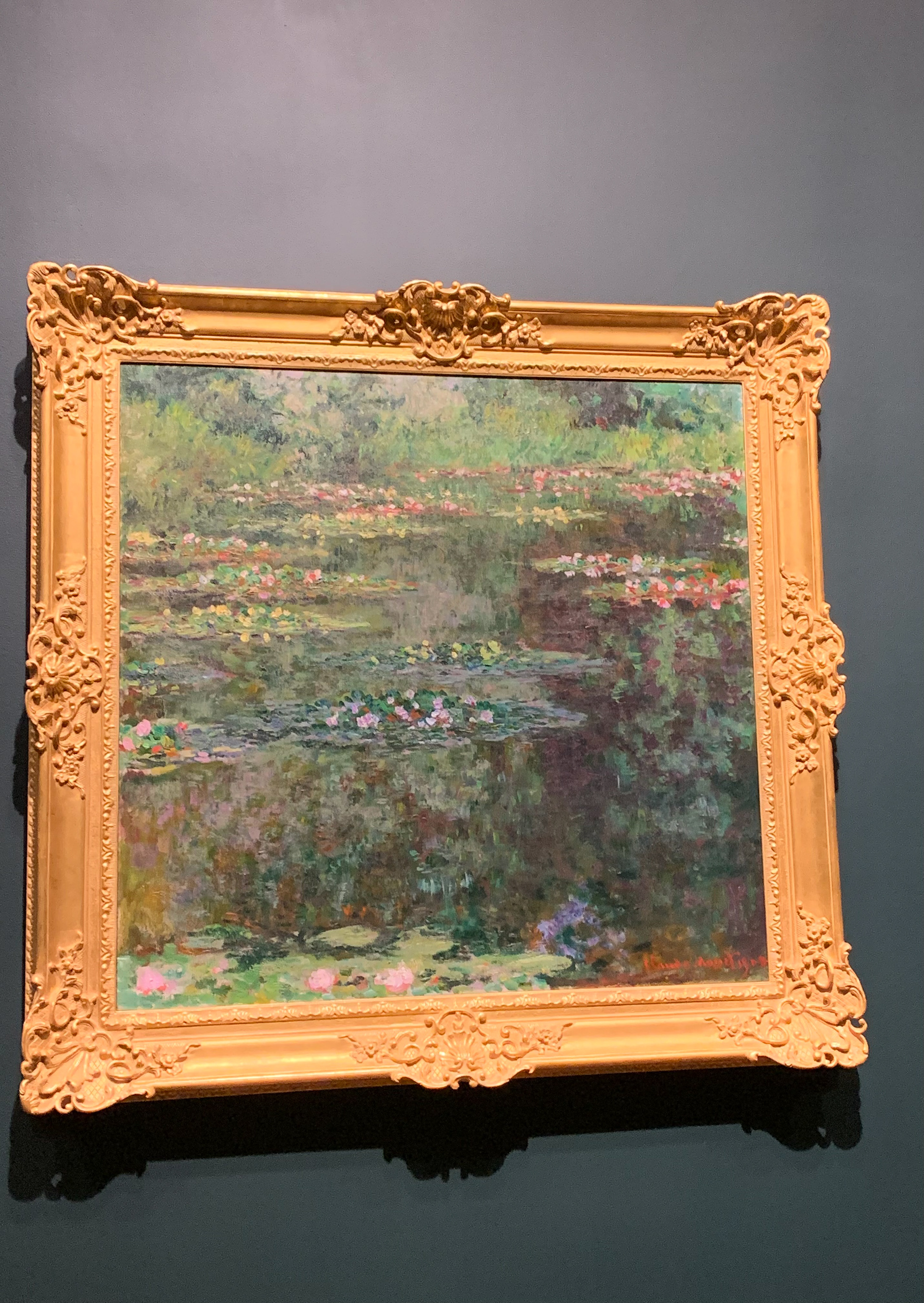
Art Institute of Chicago- Claude Monet’s Water Lilly series. I have spend a lot of time in the Monet room. While my favorite paintings in that room are the ones from Monet’s Haystack series, I see the influence of Monet’s use of colors from the Water Lilly series in my logo.